Stuck in London project (research)
Stuck in London is a comic about being stranded in a city that seems to have its own plans for me. At first, it’s all about the funny, absurd moments—because looking back, some of it is just too ridiculous not to laugh at. But as the story unfolds, things get a little more complicated, with drama creeping in alongside the comedy.
This website isn’t just about the comic itself—it’s also a deep dive into the process behind it. I share my sketches, inspirations, and ideas, along with the reasons behind my choices. There’s a lot of text here because I wanted to explain why I use certain references, what influenced different scenes, and how everything comes together.
This website isn’t just about the comic itself—it’s also a deep dive into the process behind it. I share my sketches, inspirations, and ideas, along with the reasons behind my choices. There’s a lot of text here because I wanted to explain why I use certain references, what influenced different scenes, and how everything comes together.
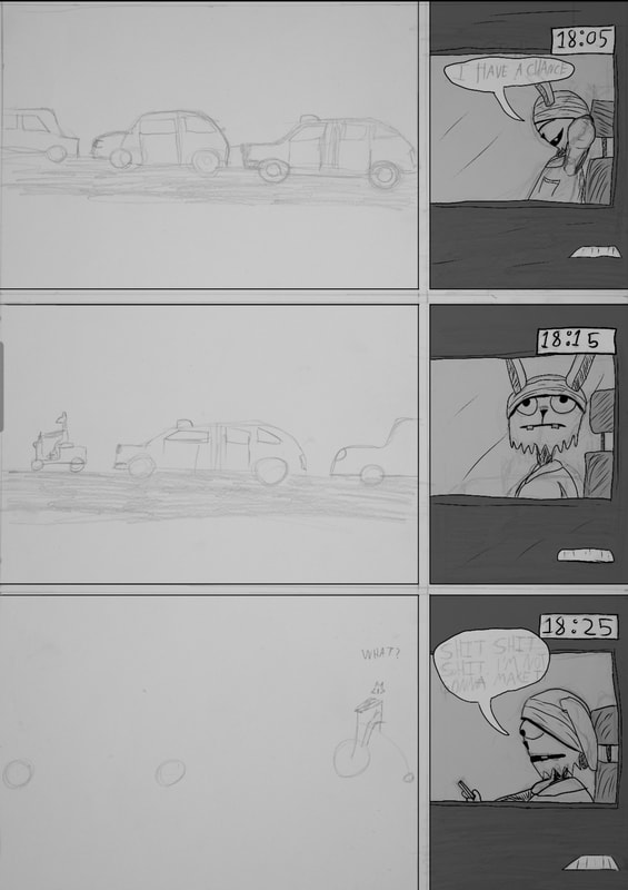
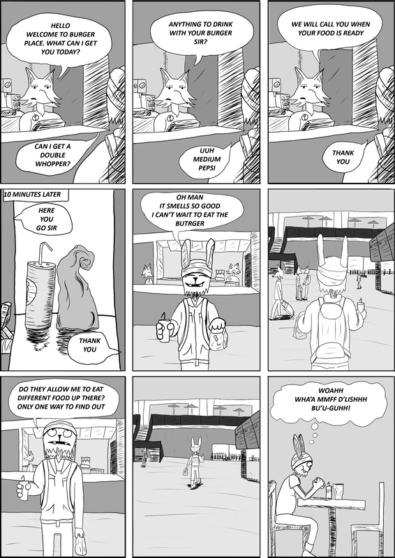
Written down about what happened on that day (written on that day)
|
|
|
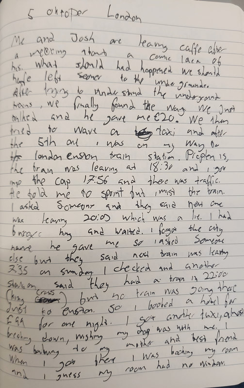
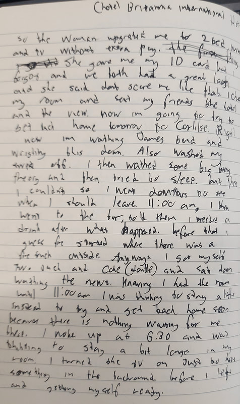
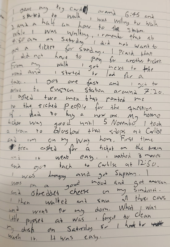
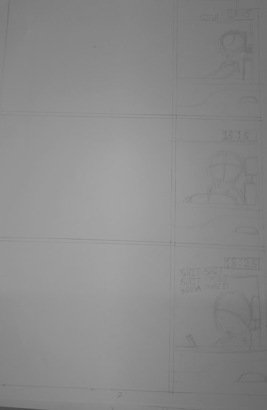
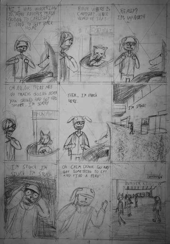
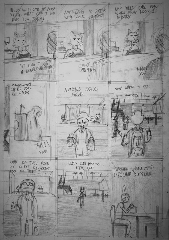
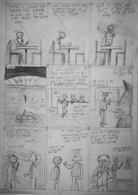
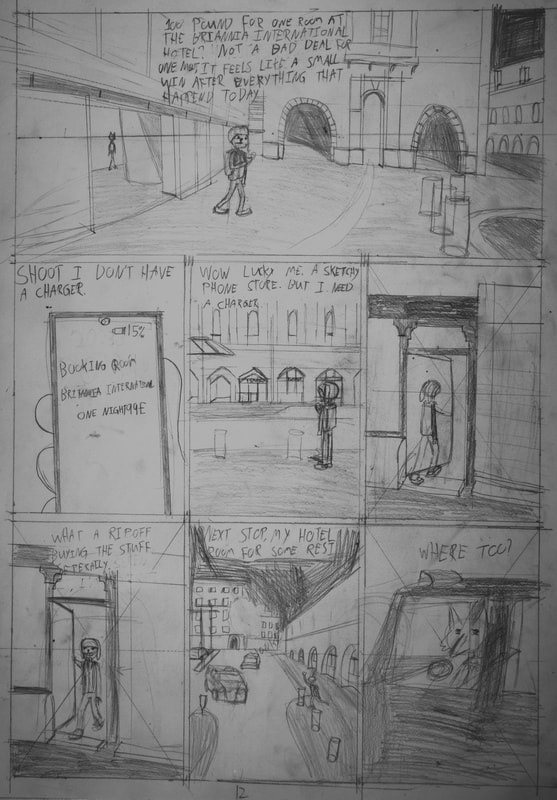
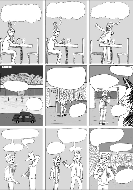
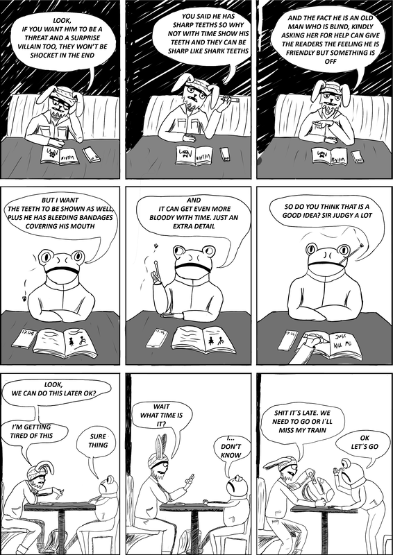
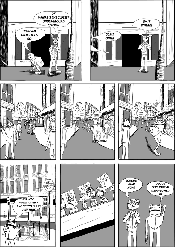
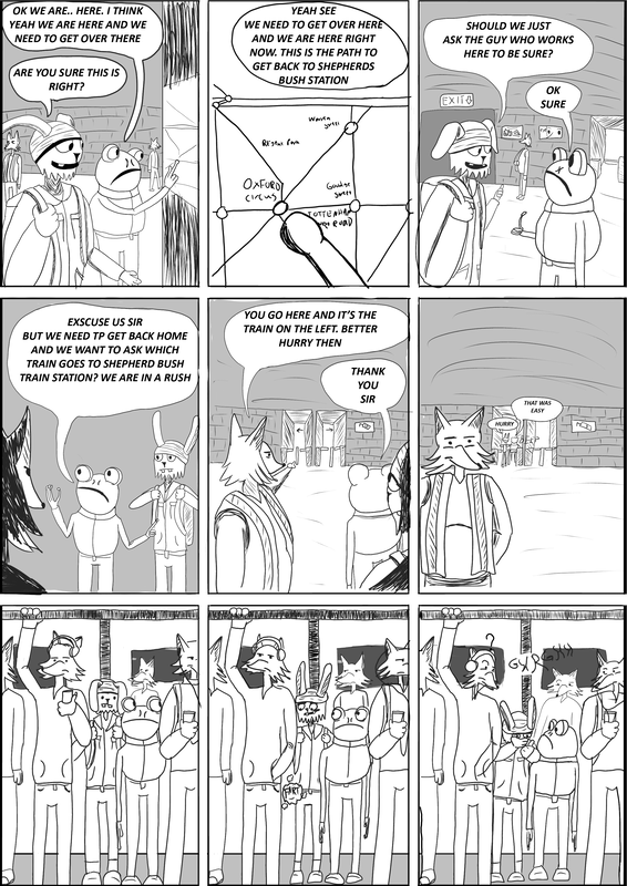
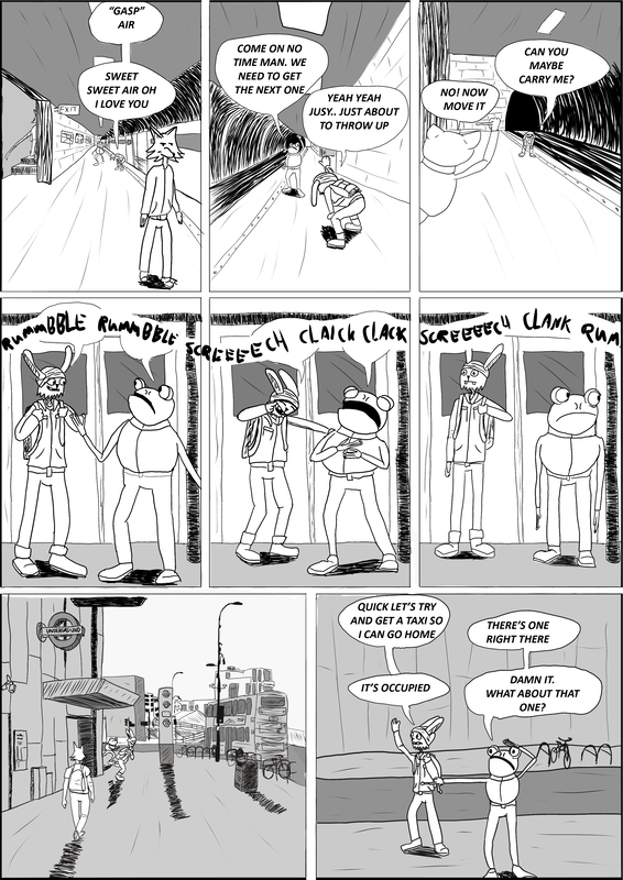
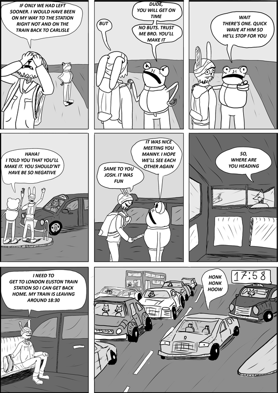
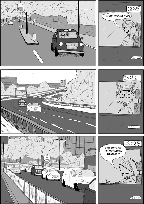
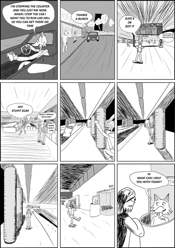
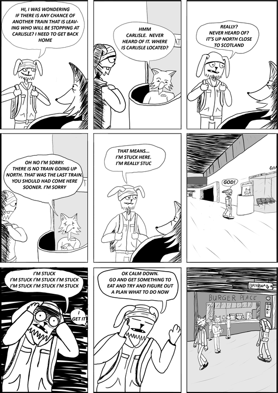
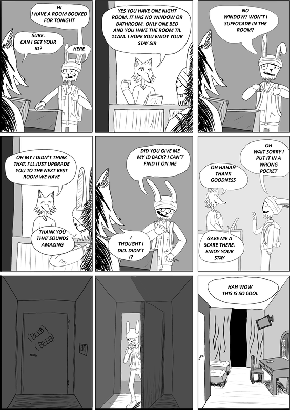
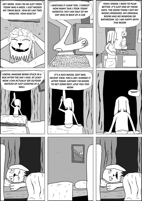
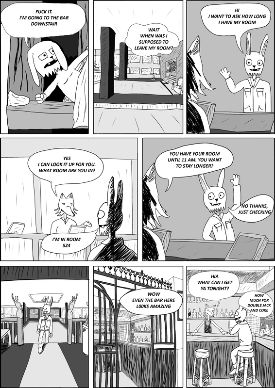
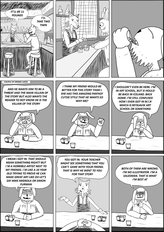
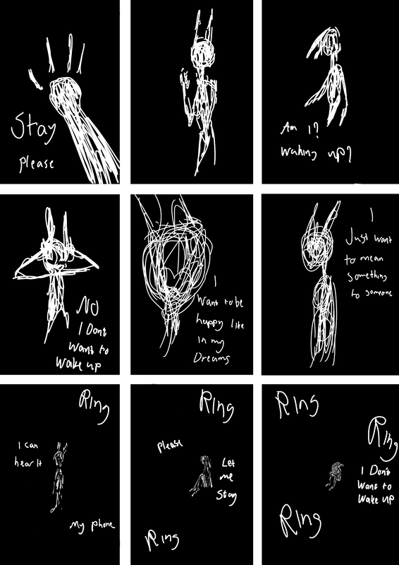
This is what i wrote down on that day. 5th of October and answer is no i can barely read my own writting. after writtng everything down, it helpet me to remember what happened and i kinda remember what i said and other said as well. So i recomend writting things down f some funny moments happened and want to make it into a story. I cut out some moments that does not matter that much like when someone told me that another train is going around 20:05 because i go to someone who you ask about time of trains.
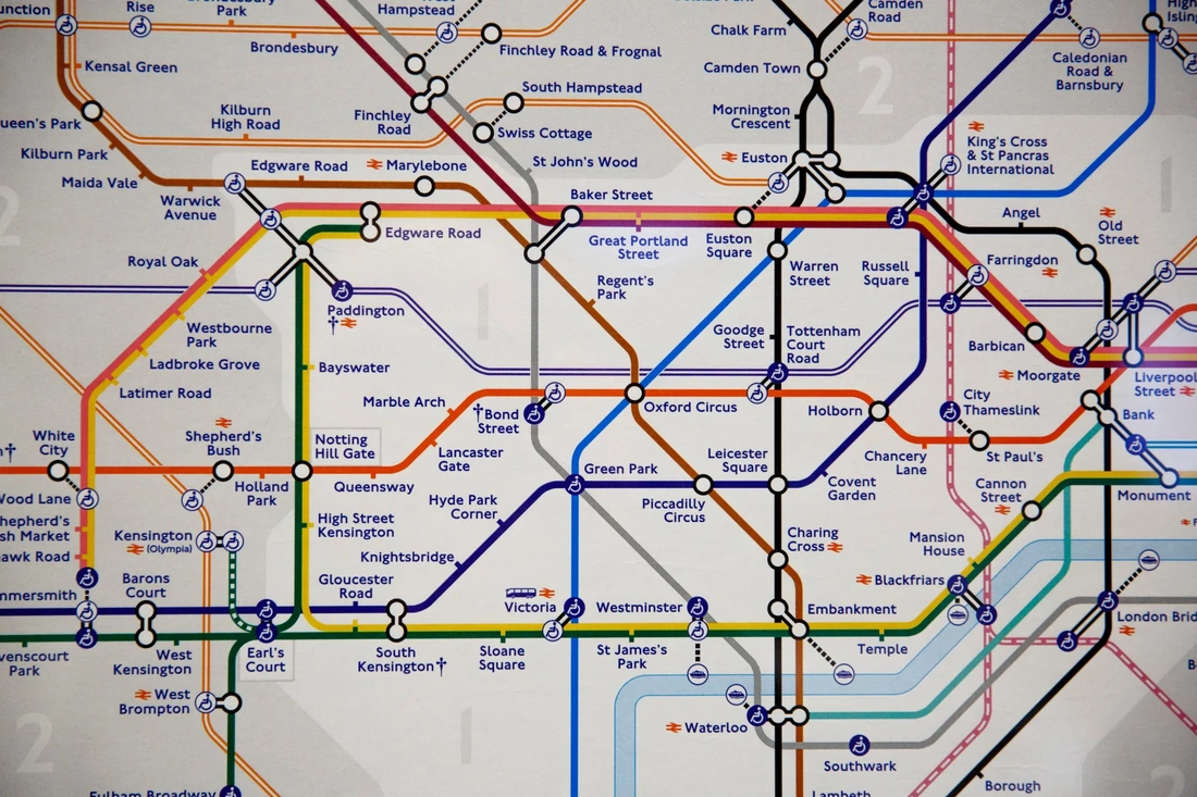
Main Locations
|
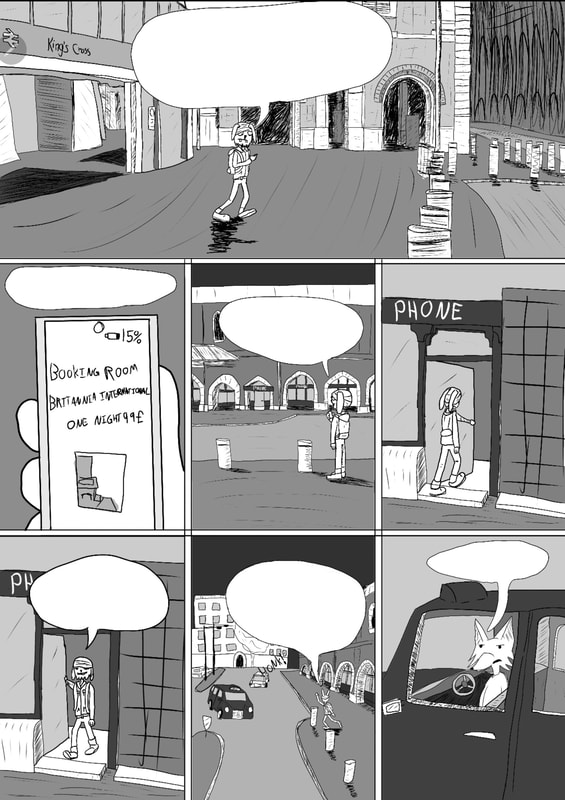
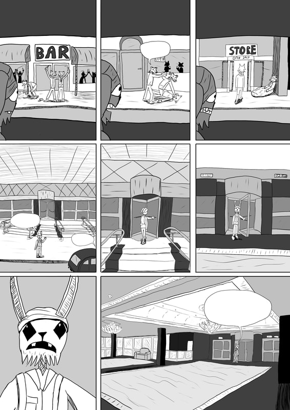
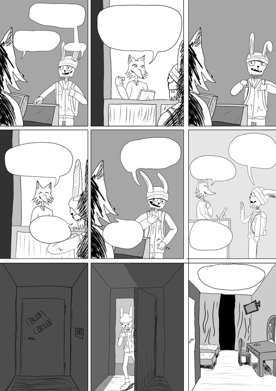
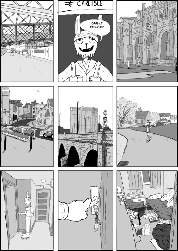
Caffè Nero
Any underground station Shepherds bush train station Britannia international hotel London Euston train station University of Cumbria Flat King’s Cross |
|
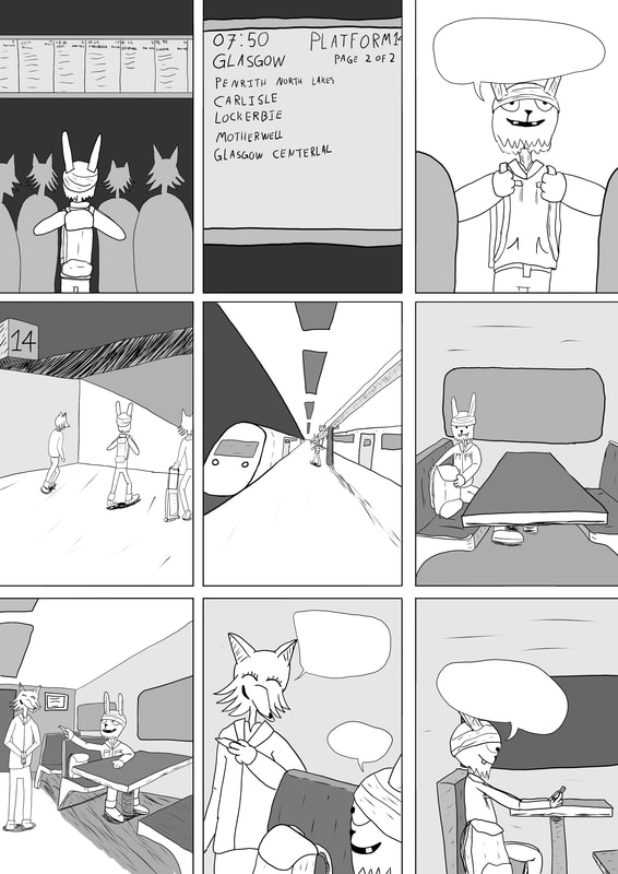
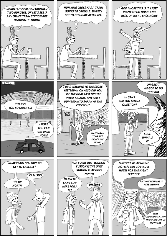
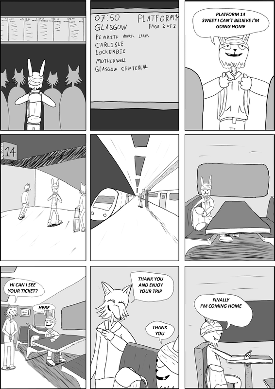
Train stops from London to Glasgov
The train route from London to Glasgow stops at many stations, including Watford Junction, Milton Keynes Central, Rugby, Stafford, Crewe, Warrington Bank Quay, Wigan North Western, Preston, Lancaster, Oxenholme Lake District, Penrith, and Carlisle. Reason why i have this is just for me to know when i am creating the page where the train i am going to has stops
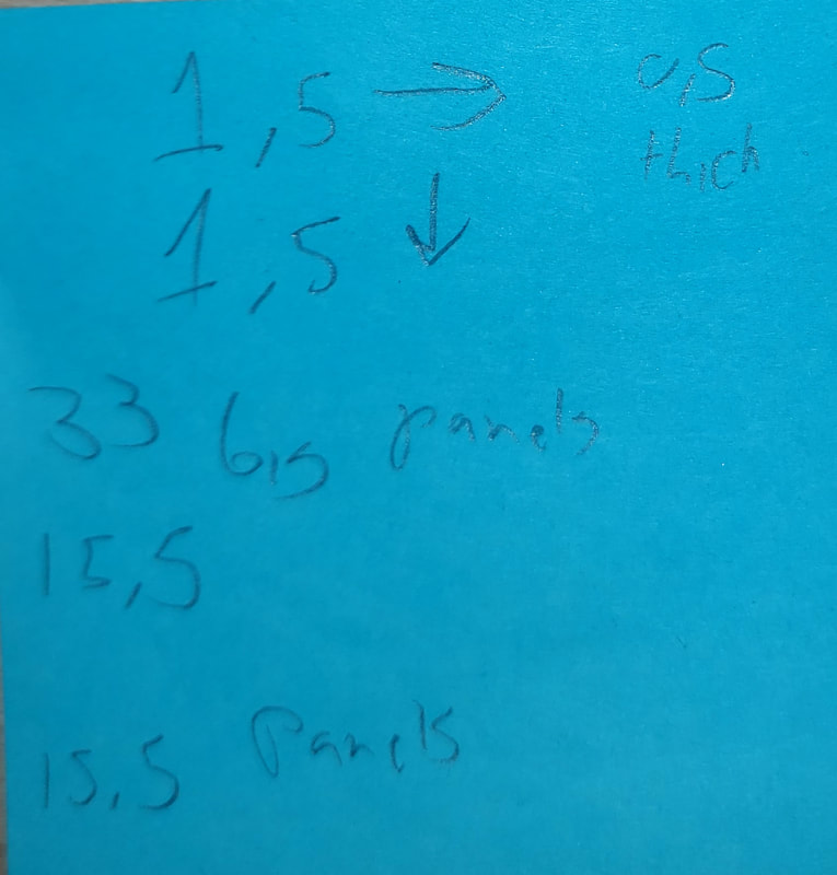
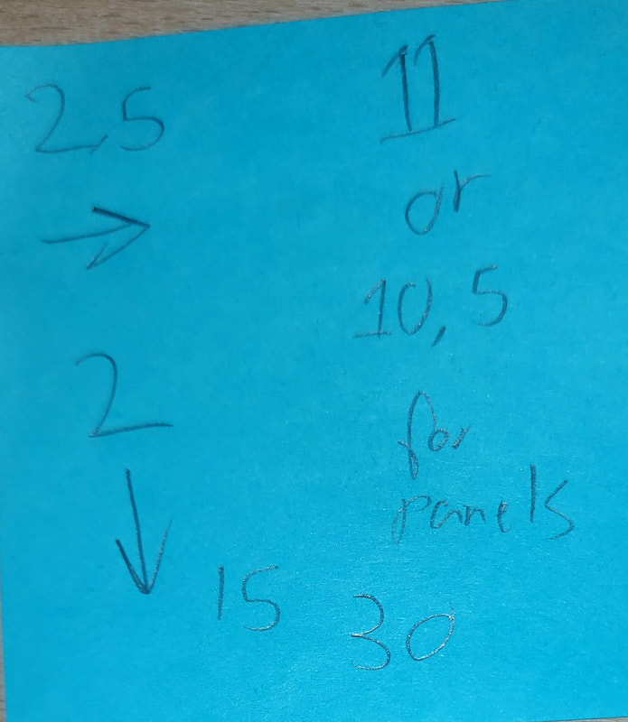
Measurements
|
|
These are some measurements from the comics underneath. This is for me to see what kind of measurements i need for the panels and the frame for where to work, so if just IF the comic is being printed, it wont cut any of the panels.
The thickness is around 2,5 or 1,5. i need to see what is best to have. 10,5 is the panel size of the panels. 15.5 is for medium and 33 is for big. Got these from the comics as my reference for the panels. |
These measurements might be used for Dreadnought last stand but more modified. these reference and measurements are for future comic idead, if im lucky to get that far.
Work will be in a A2 or if its not working A3.
Work will be in a A2 or if its not working A3.
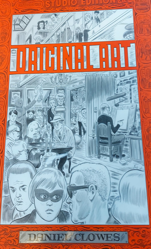
Comic inspiration for the panel sizes
|
|
|
|
|
|
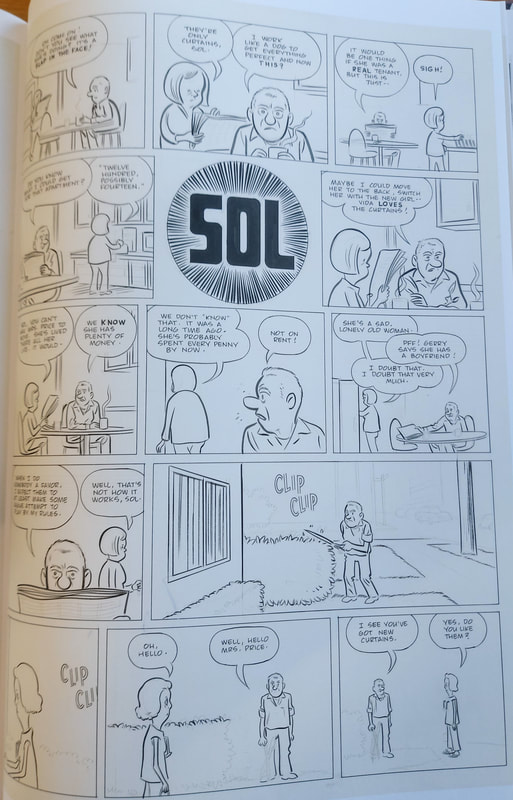
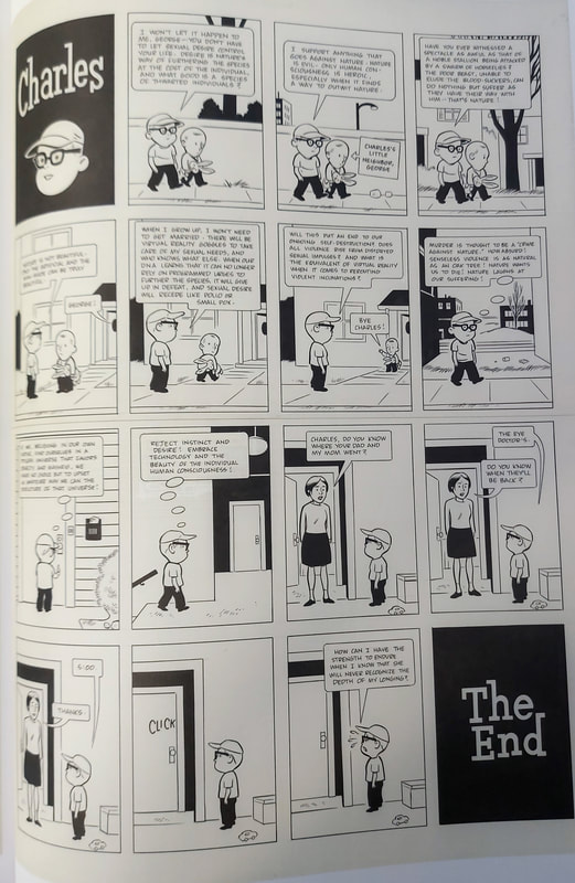
These comics are all in same book as seen above. A lot of comics panels and sizes. some still have their sketch lines and show you how the comic is made. Helps to see how it is to make a simple comic. Due to my arm being weird with crooket bone but i am willing to risk it. These ones are the measurements from
Movie inspiration for the flow of the comic
|
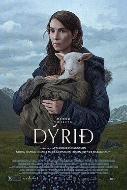
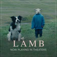
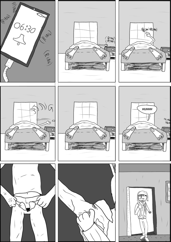
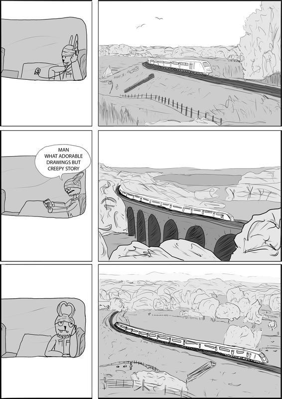
The pasing of the comic is similar to how the movie Dýrið (Lamb). What i mean by that is similar to Lamb, there is going to be long silent, three panels with just the same panel but with some minor changes to show how i felt (like in the underground train when it was crowded) and when i am going to the train station and when i get back home.
The movie is mostly art project and i do recommend but heads up, its weird and moments that feel odd. Update (25th of March) the flow is close but not like the idea i thought of at first. there is quick moments but some moments that last too long like in the movie. |
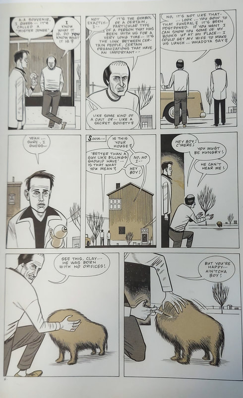
Comic inspiration with the build of the pages and panels
|
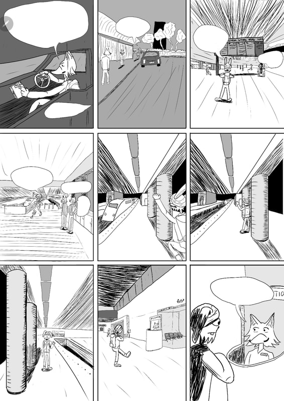
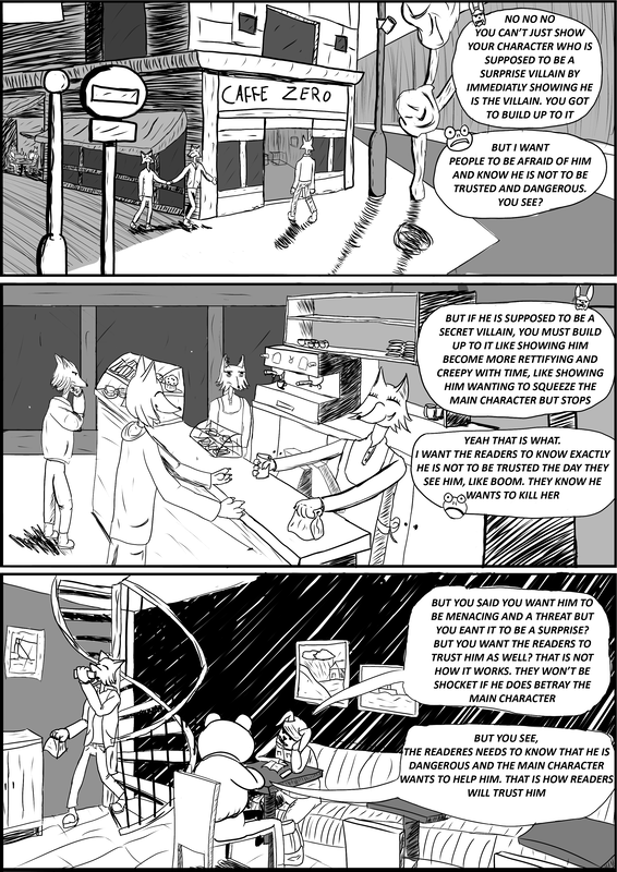
The panel and how it is made is when a character is talking, its like a movie in a comic book form. Where we see the back of the person you character is talking to abd when the other is talking we see them and the other is jsut their back.
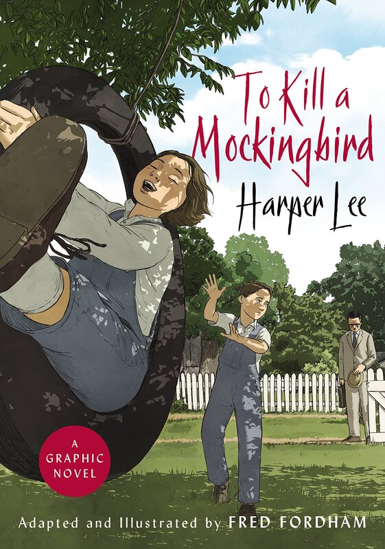
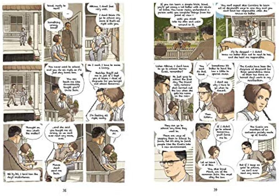
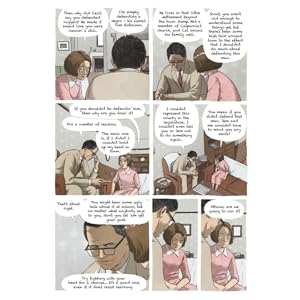
It feels little bit like its a storyboard sometimes in this book. A lot of speech bubbles in the book so to prevent making a lot of details and it will be gone when the speech bubbles pops up, the drawings are sometimes close up of the person face or soomed out to give more emotions of their words. Due to having a lot of text and words in my story, seeing how the "TO KILL A MOCKINGBIRD" by Harper Lee graphic novel is drawn, show i can have some panels mostly like half of the panel drawn and the other half for the text. For instant the second page of the comic is 80% just talk and nothing happening. |
|
Pages reference from above
These pages are some referense for where i want to have the speech bubbles
|
|
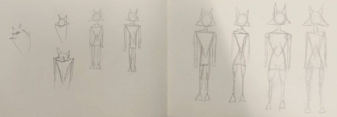
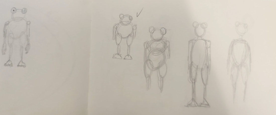
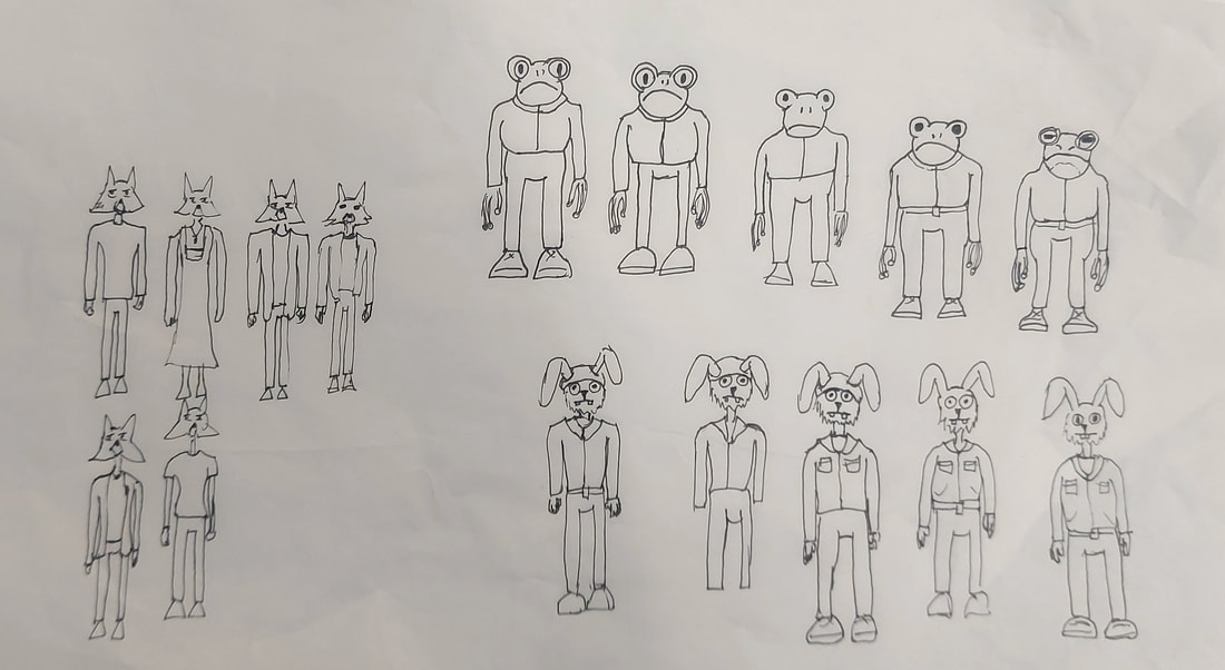
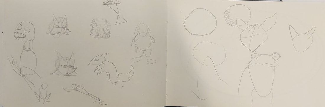
Comic inspiration on art style
|
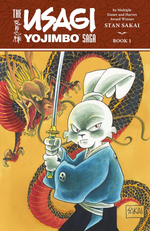
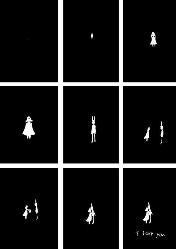
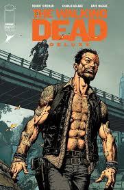
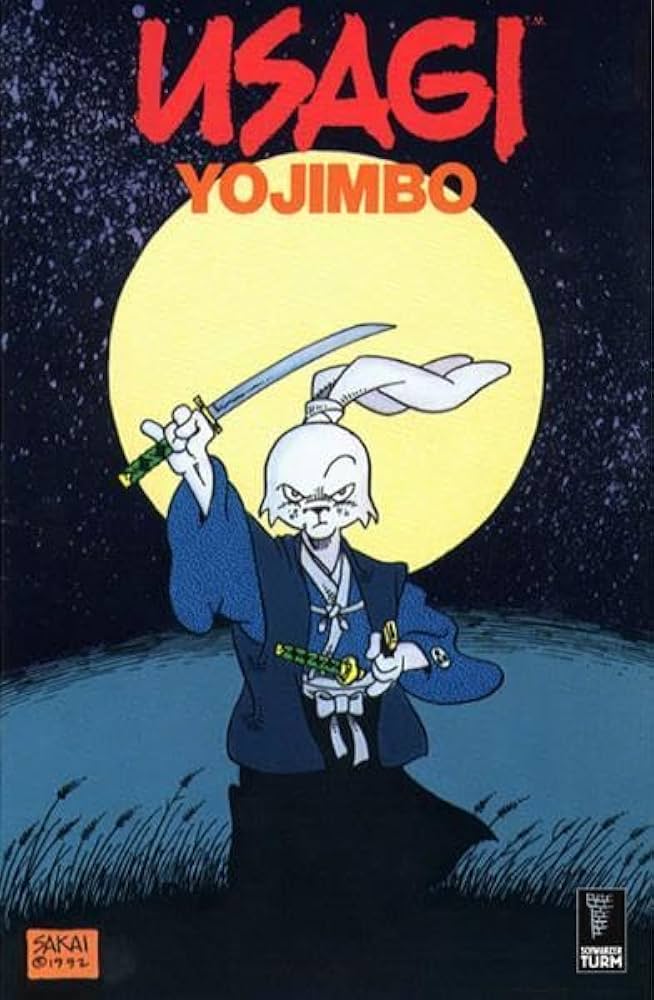
Comic Usagi Yojimbo written and drawn by Stan Sakai is the art style and also one of the many reason why i wanted to make comics. The art style is simple but can still show a lot by showing little. Funny to say no Usagi Yojimbo is not the reason why the character (which is me...) is a rabbit, but a funny little accident.
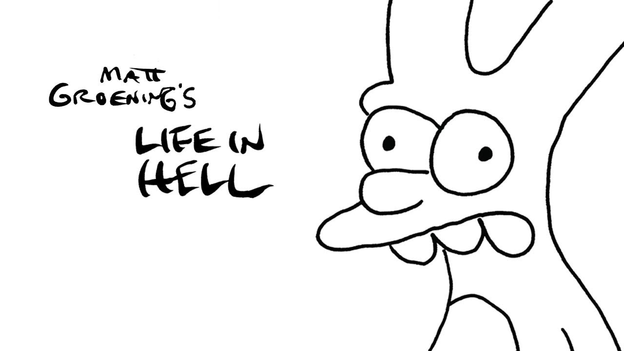
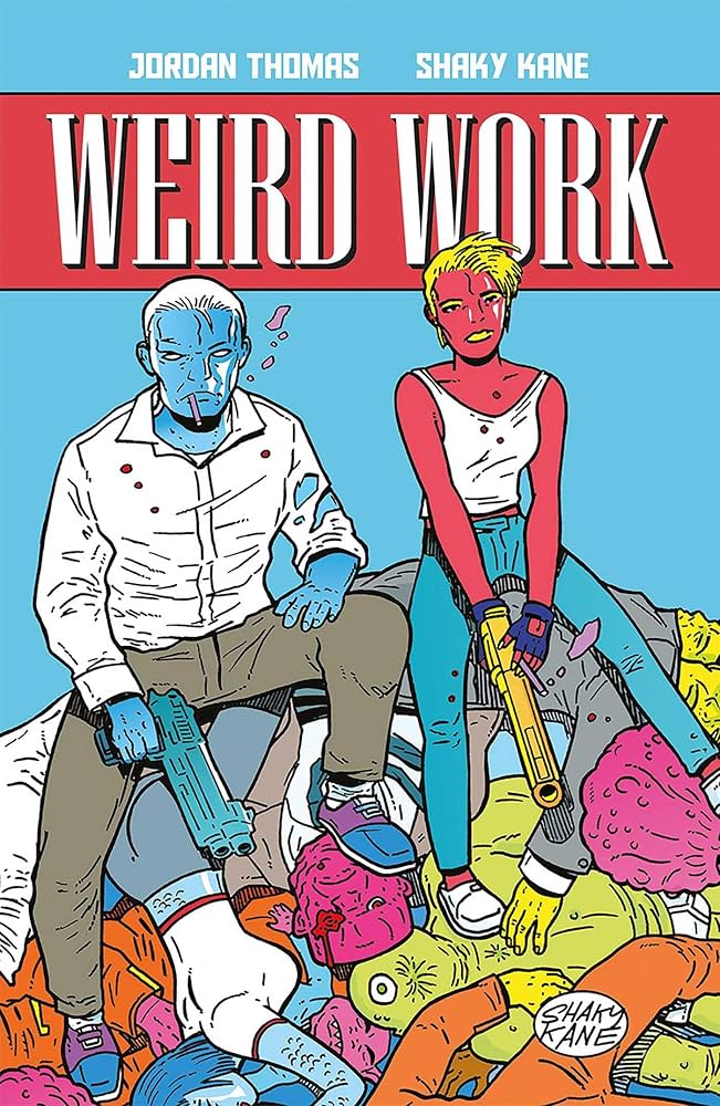
Matt Groening the Simpsons style is also little built into the comic. I want to try and make the character(s) memorable when you just see their silhouette and know who they are. Again having him as a rabbit is not because of Life in hell Matt created. Weird Work after writter Jordan Thomas and artist Shaky Kane is really colourful comic book. I got to meet Jordan and have two books with his autograph. Lucky for me it is the comic that showed me if the story or the plot is good and the art style makes it work, for example the comic Weird Work, the characters are colourful and the world is just random. But its still fun to look at. I cannot wait for the sequel. Im starting to read Man from maybe, the new book by them as well and the art style is similar but silly Used to own a lionhead mix and he looked like he had a beard so that is why i am making me into a rabbit. Also the ears can give expressions more easily |
|
Actual photo of Kasber my old rabbit. What a nice hair
|
Speech bubble, how to use them
This account Bad Ink Studio shows how to make a comic and also how to use the speech bubbles in ways to show what is going on. For example if a person is sick, angry and/or happy. Here are some video from that account. He has a lot of YouTube short
|
|
|
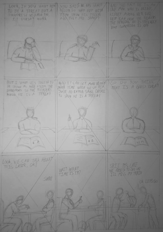
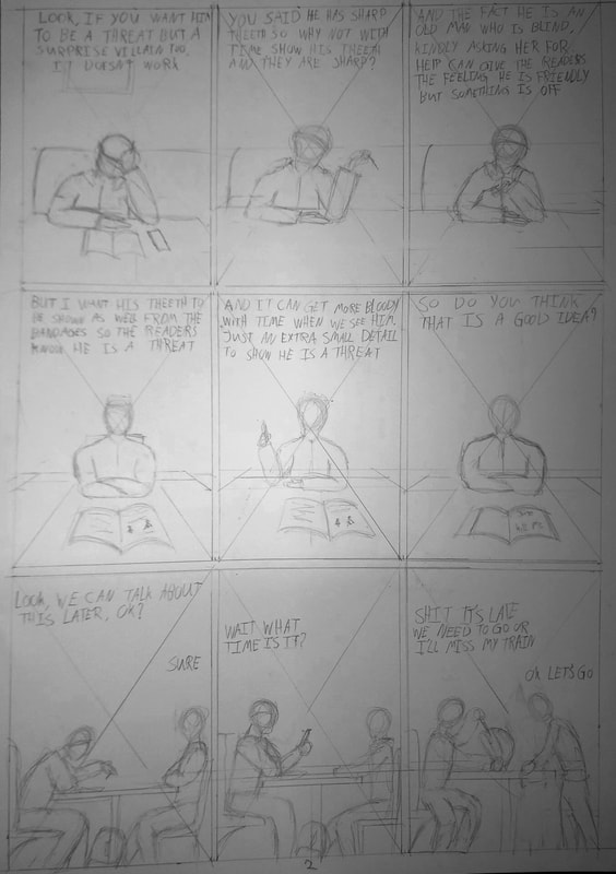
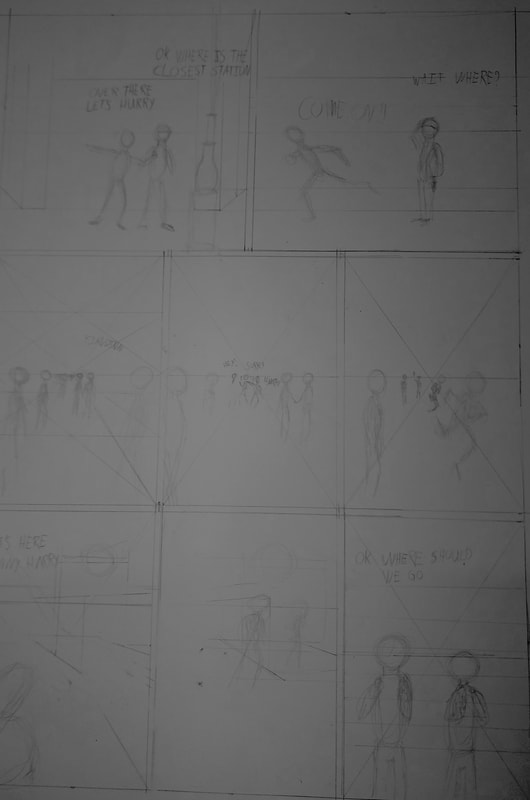
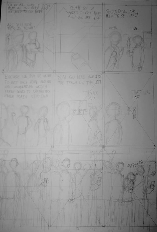
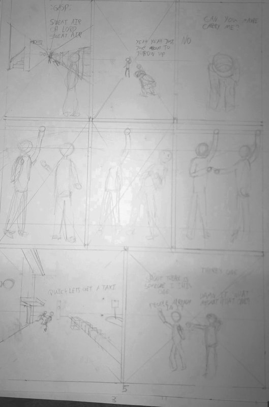
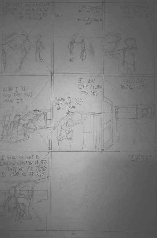
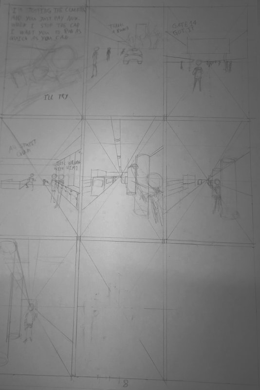
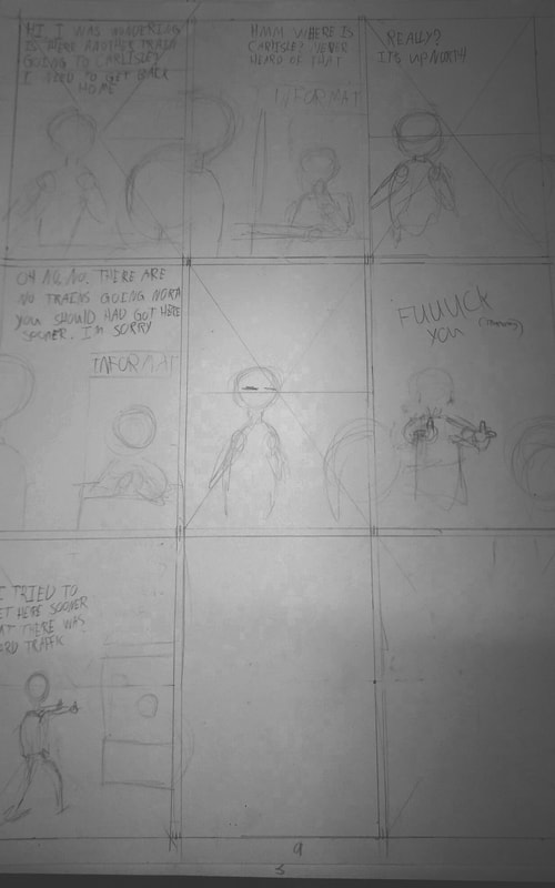
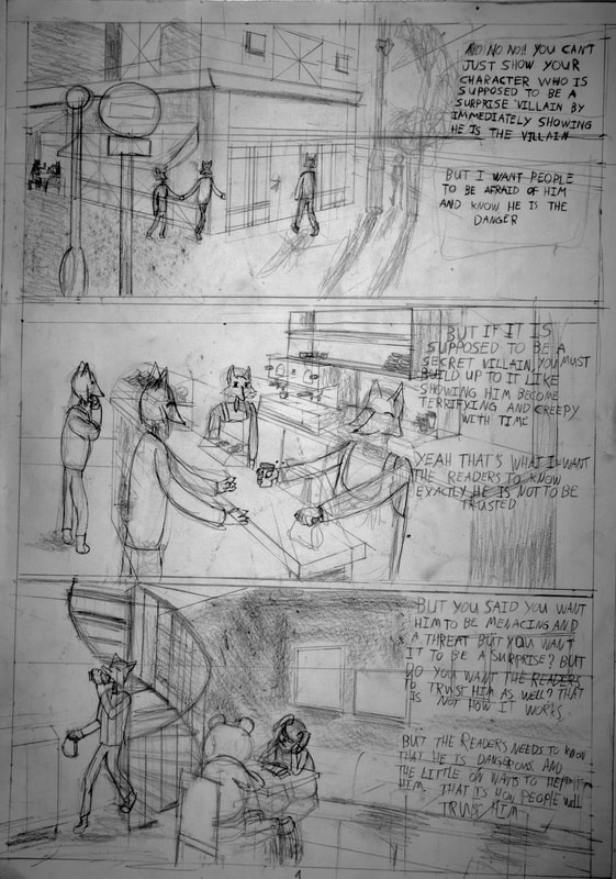
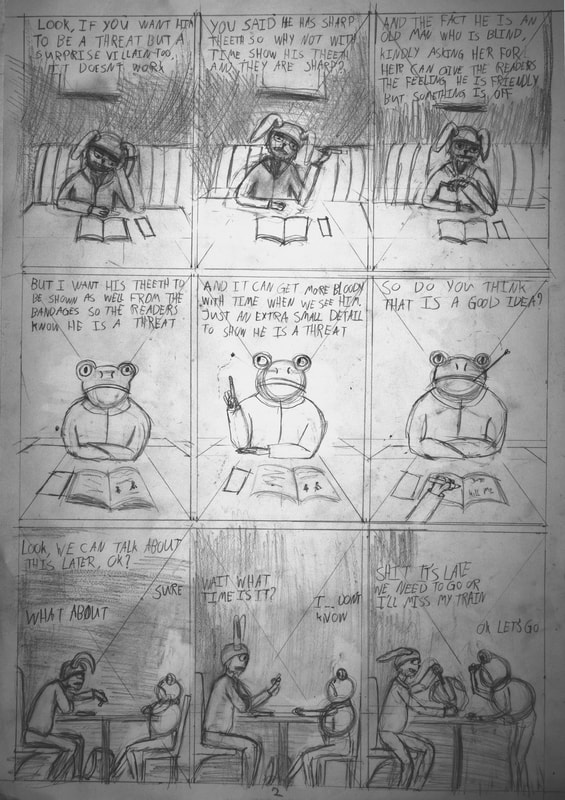
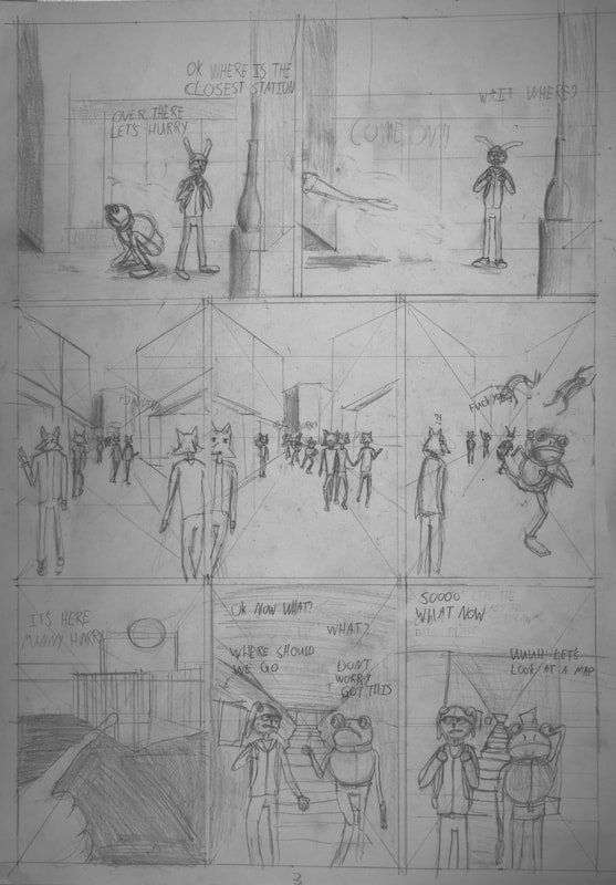
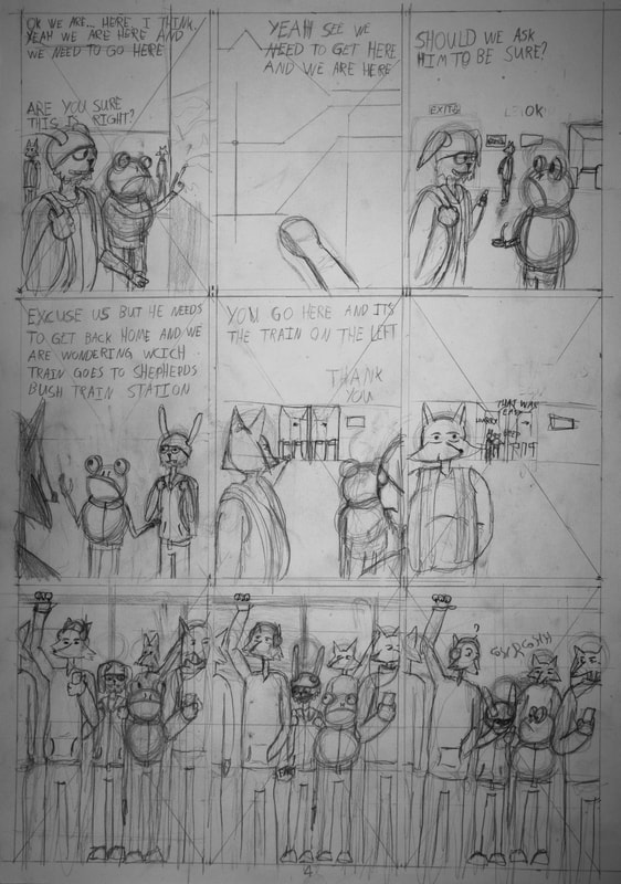
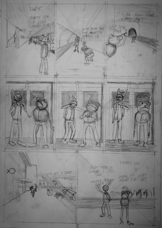
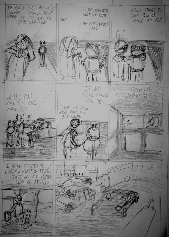
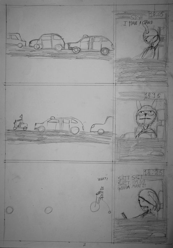
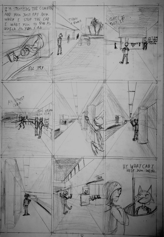
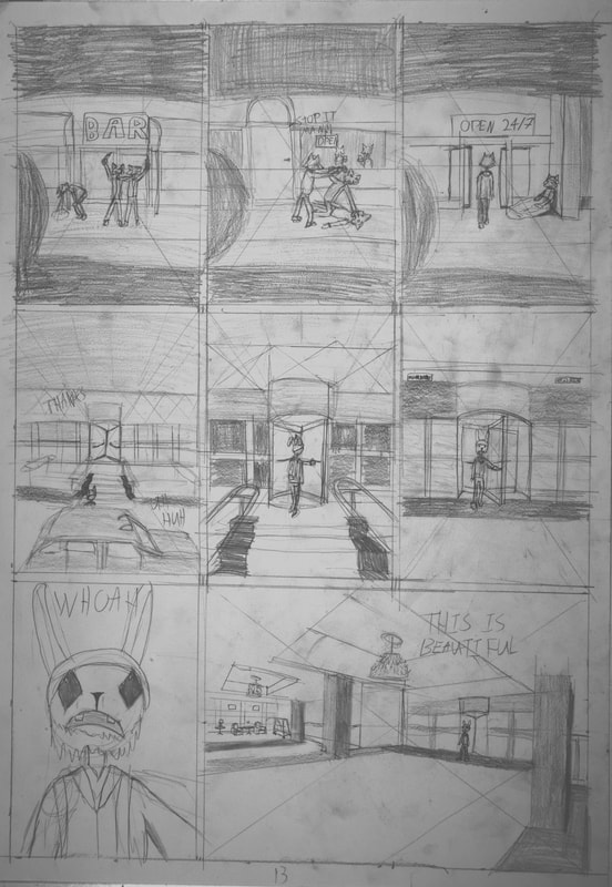
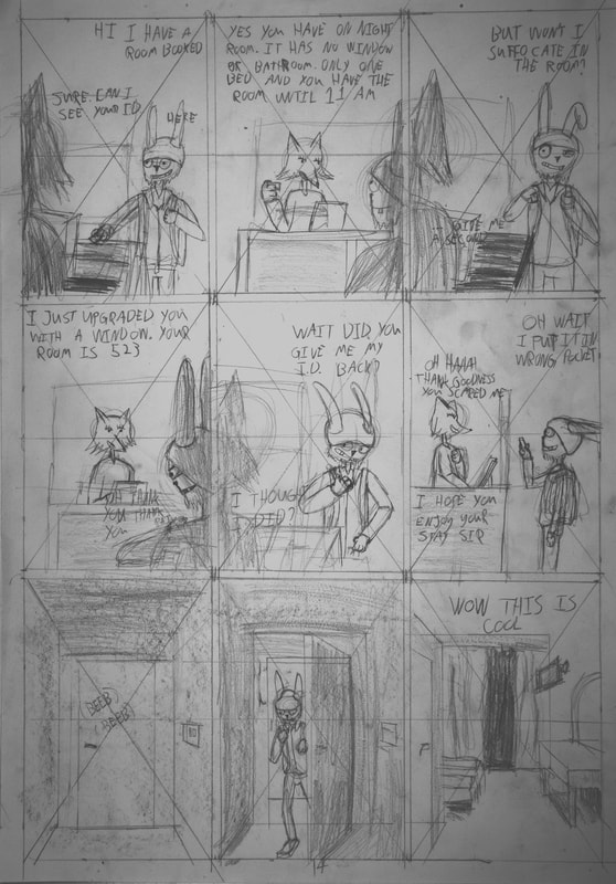
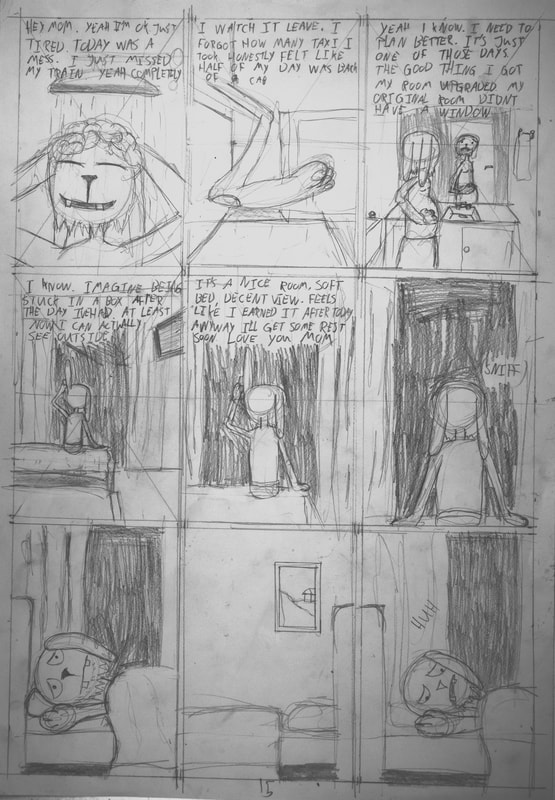
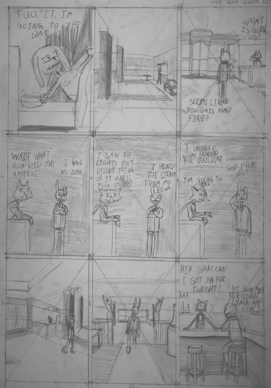
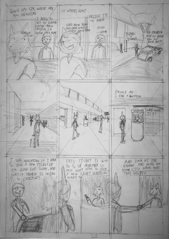
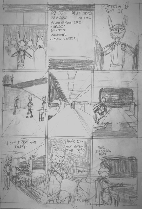
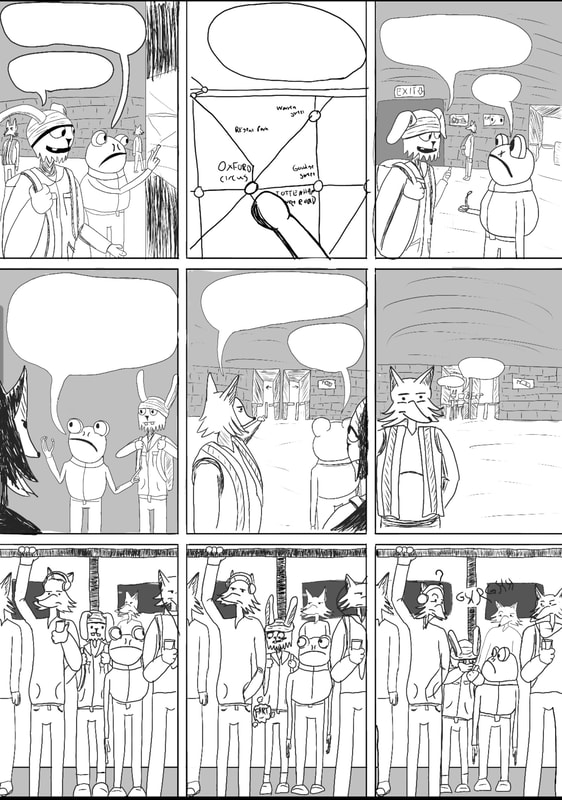
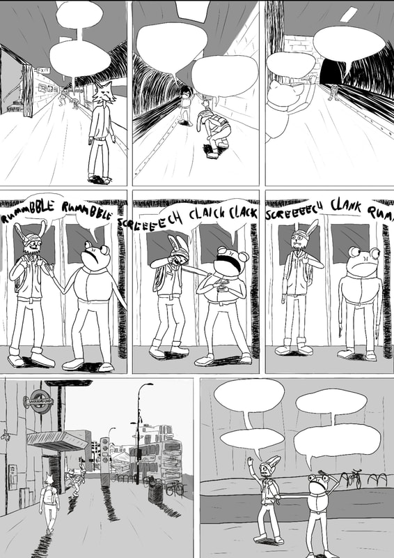
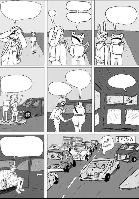
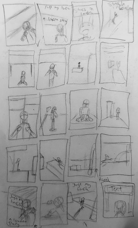
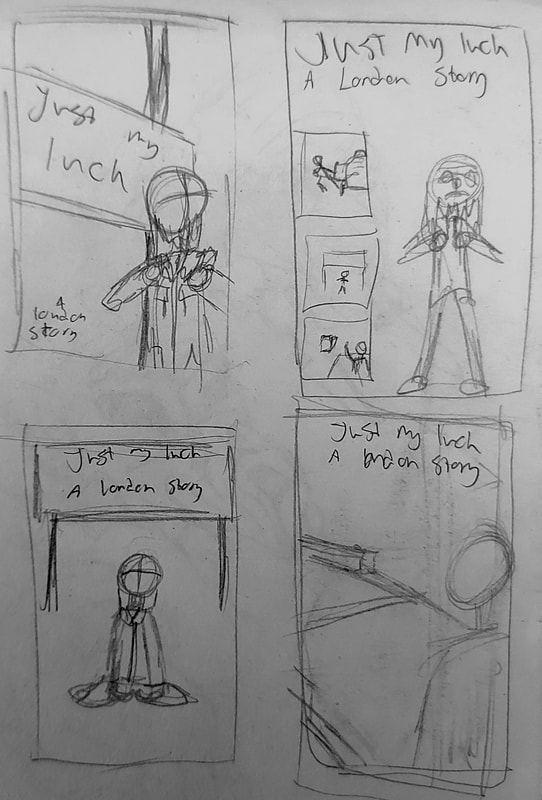
Sketches of pages (idea)
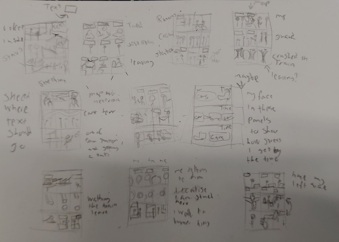
Here are sketches on where the text should be in the comic and with some small part of that the panels should look like. The text around the panels are details on what is going on and what the panels mean. All of the information of what the pages should look like is written down in Google Docs.
Comic panel sketches
|
|
Here is some sketches of the first pages. The text is just drawn there to let know where the text should be. After finishing all the pages, pen will be added over it and then digital drawn later
180 Degree rule
|
To help with how the panels should look like with the rle of 180 degree camera. It is to help having cpnversation with characters in the story. Thank you Tony for sending me the video
|
|
|
What not to do with 180 degree rule
|
This video shows what happens if you break the rule. It can ruin the moment and movement of the story that is being told
|
|
If i have more than two people talking
|
This video shows that to make three character talk, you have to have it in a triangle shape. For example you are drawing a star but you made a half a star instead. That is how you make three people argue or talk. Well that is what i got from this video
|
|
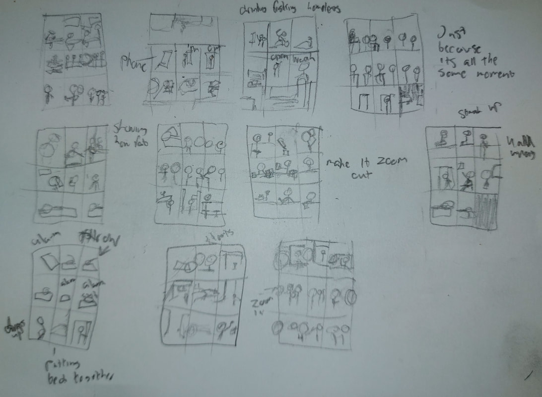
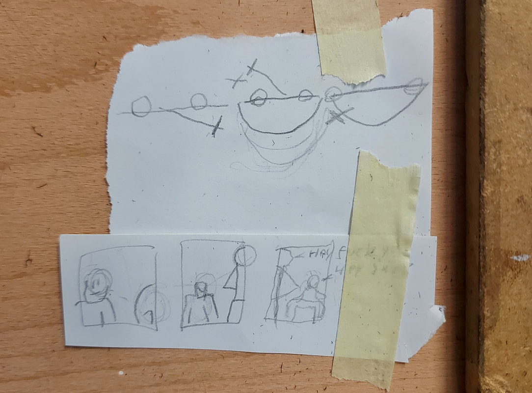
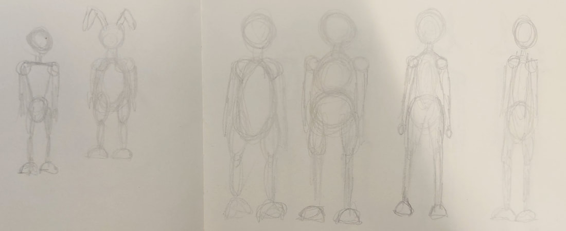
All sketches of the pages of the comics
What are those?? oh character sketches... huh
Honestly this was kind of fun to do
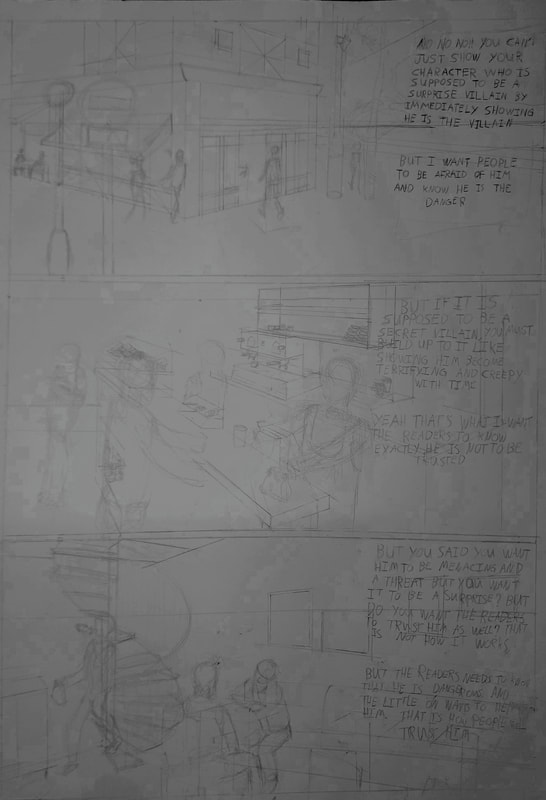
Pages sketched up with shadows and characters (development)
What is being seen here is not the fully panels. Some will be changed and some of the pages will not be boring like every pages are
Name for the "comic"
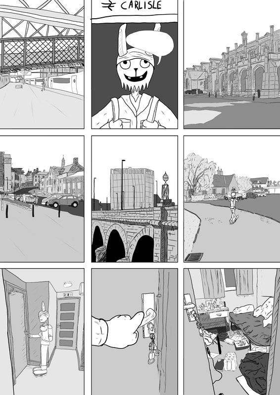
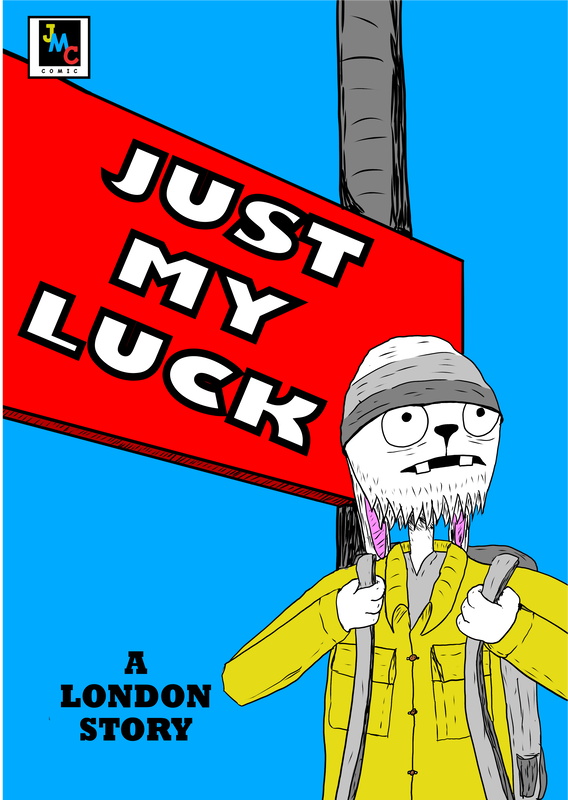
1. Last Train to Carlisle (because it was the last train i missed) 2. Train, taxi and lost hope (trains planes and outomobil) 3. Stranded and lost (because i was stranded and didnt know where i should go) 4. Running Late: A London Misadventure (if i want to make it a series (got some late stories on my back)) 5. Two Minutes Too Late (was ecatly 2 minutes late) 6. Lost in London (explains itself and similar to stuck in london) 7. One Night in London (sounds like a one night stand) 8.Unplanned Stay (true) 9. Just My Luck: A London Story (if i want to make more like that comics (im looking at you Nettherland))
Looking at using 1 (last train to Carlisle), 5 (two minutes too late) and 9 (just my luck)
Looking at using 1 (last train to Carlisle), 5 (two minutes too late) and 9 (just my luck)
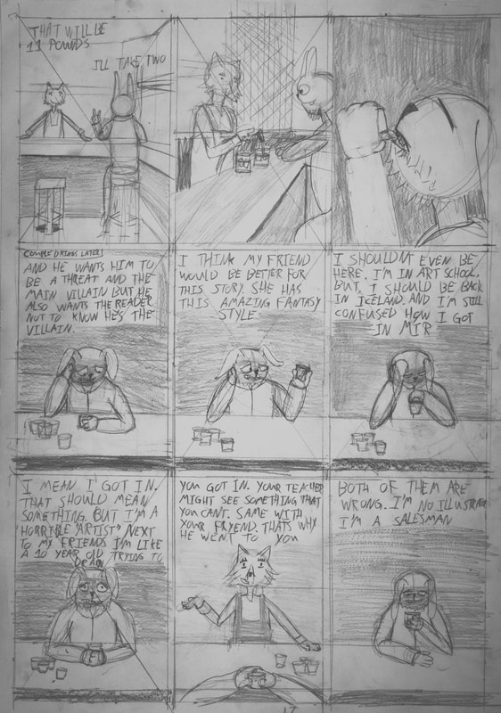
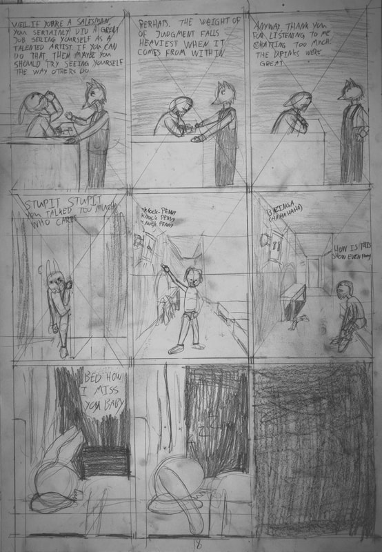
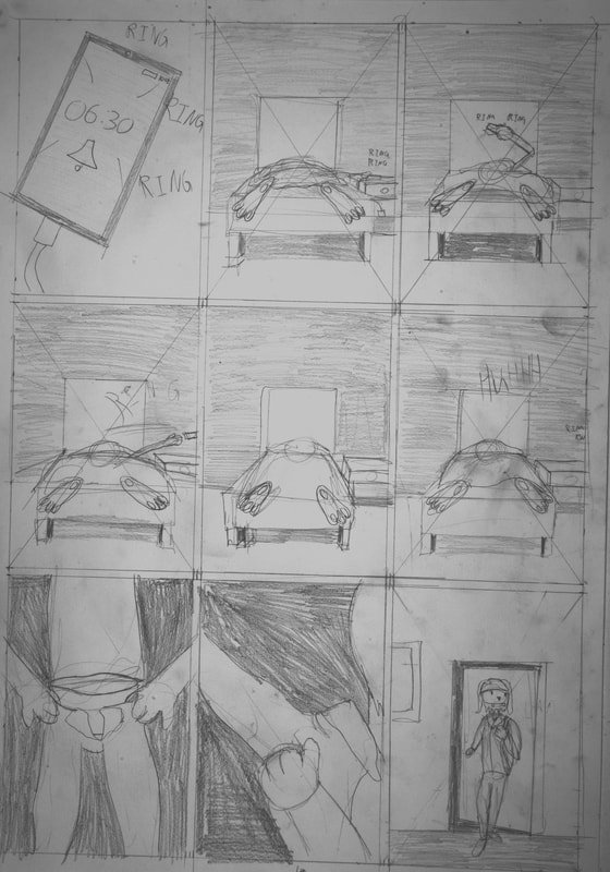
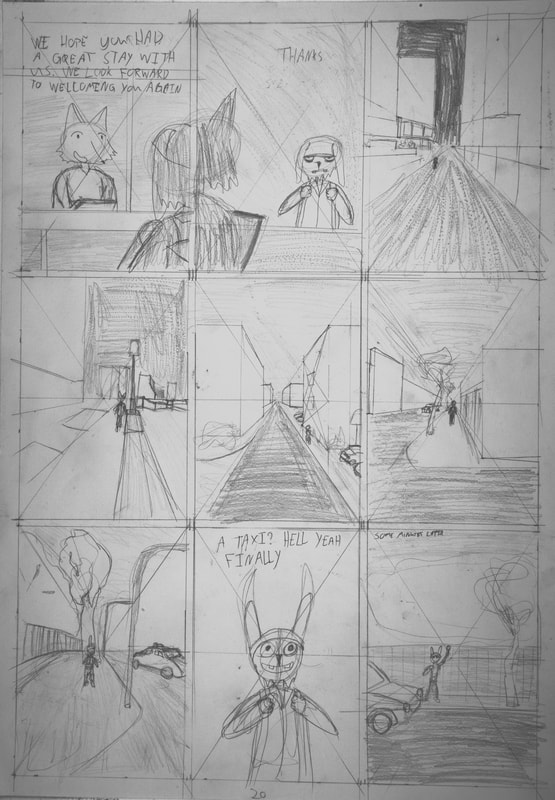
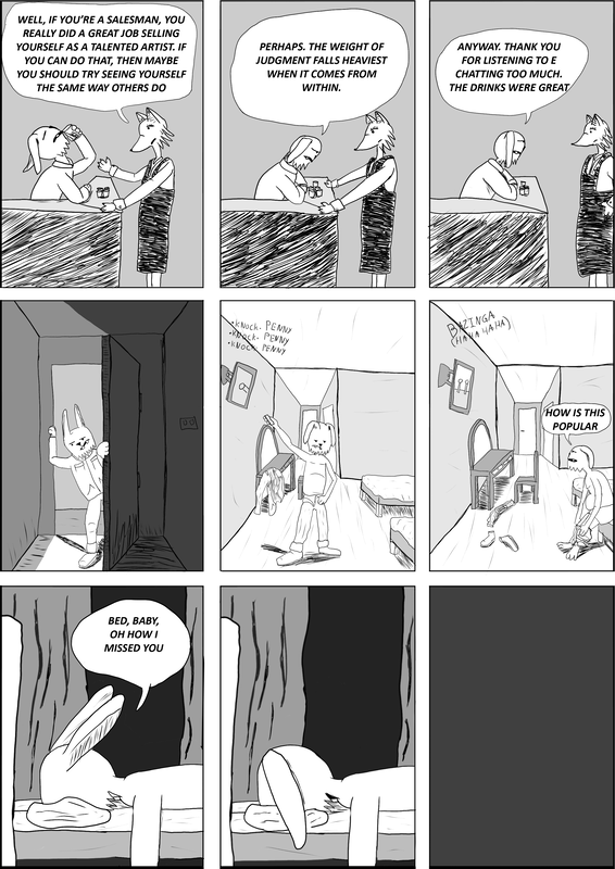
Black and White (no text)
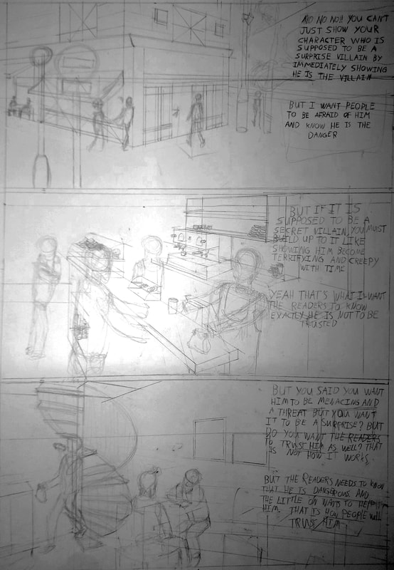
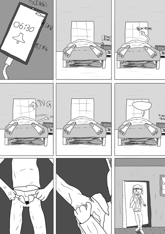
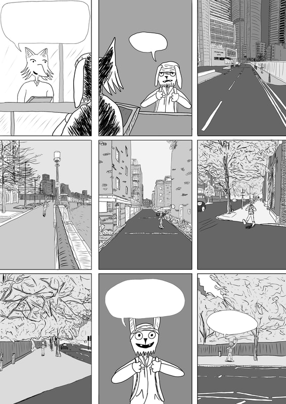
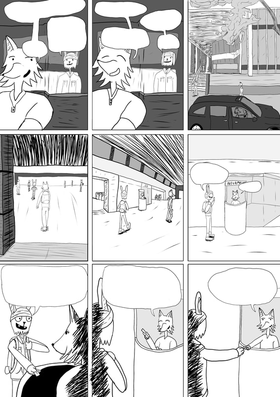
I can happily say that working on this comic is something that i do not like. Finding errors and mistakes after hours of redrawing and seeing (for example) the cars really messed up and wrong drawn. Best i can say it is "underground comic style" but that is just putting dirt on comics that actually deserve to be called that cause this comic is not that. What i can best describe is this is like a teen who wants to make a comic making a comic for the first time. Characters are different in every panel and i mean legs are thick and then thin, same with arms, heads are always looking weirder and weirder, and the grey tone is not helping the comic (well it is with how much white empty flat tone the comic looked). Going over the sketches there are some panels, not many, three or four panels have changed. Just seeing the empty bubbles is bothering me but i am still desighting text from computer or my writting. If my writting i need to be careful it is understandable. My hand writting is so bad
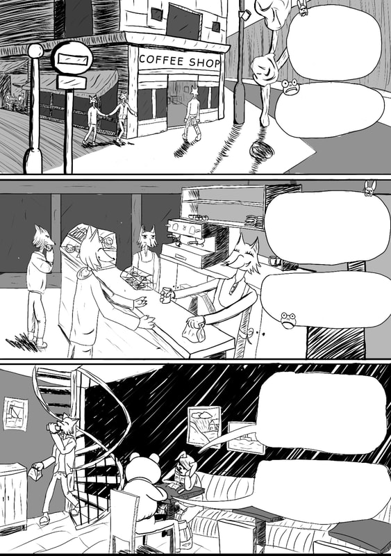
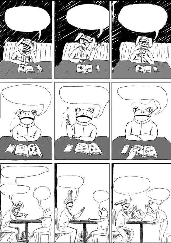
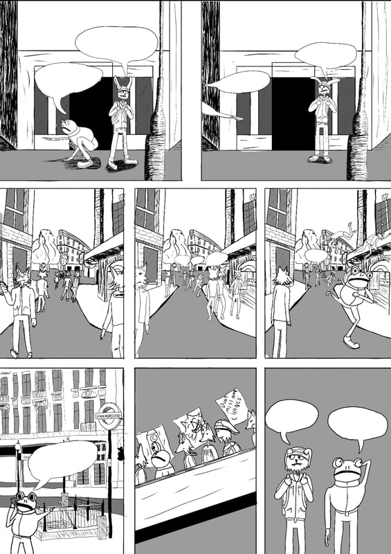
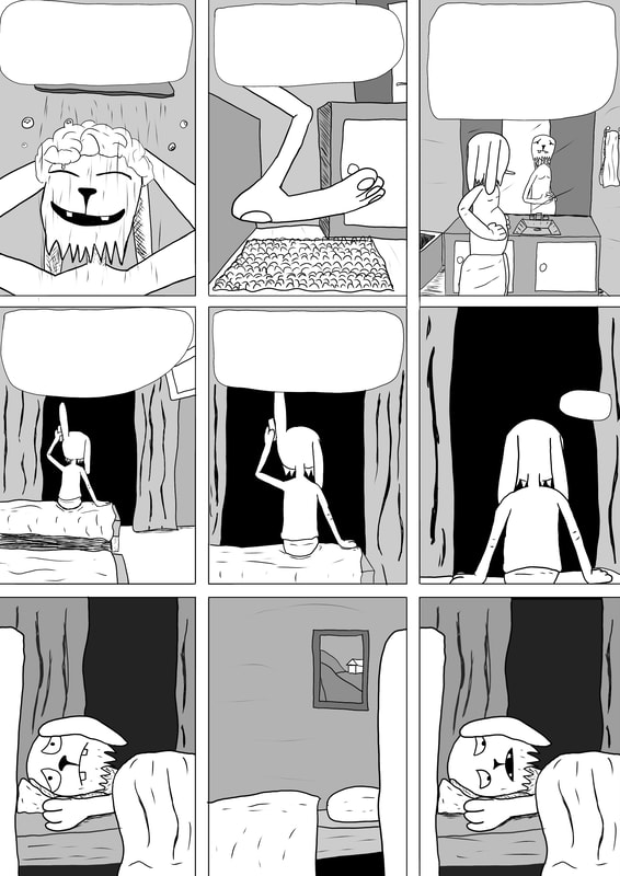
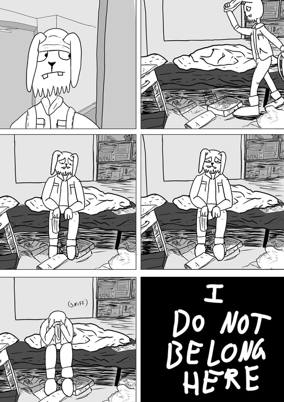
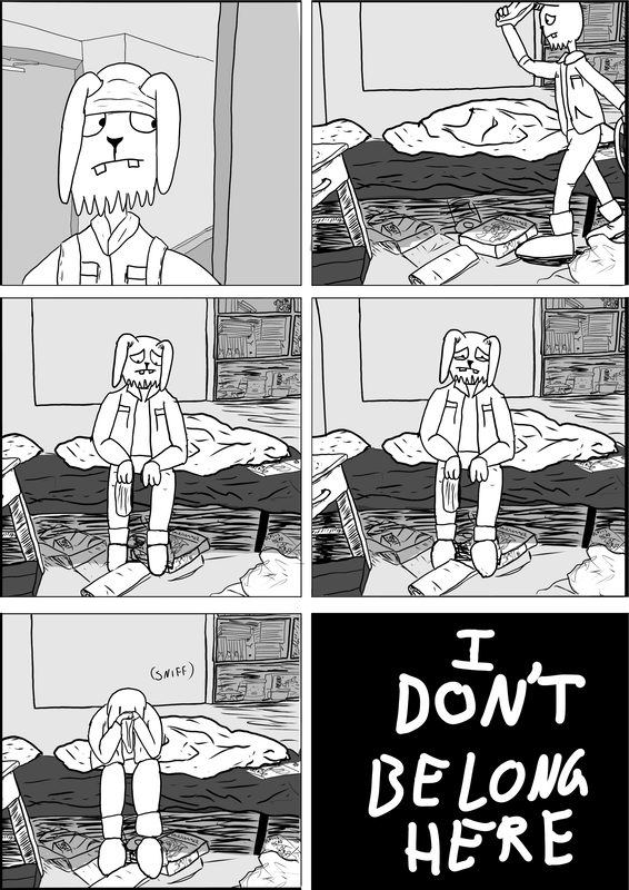
Pages i am most exited to draw are pages 17 and 18. Reason is that i want to work on making a dramatic moment feel like dramatic. First time doing such because i usually make action, boring and/or funny moments. So working on pages 17 and 18 can hopefully help me with making drama
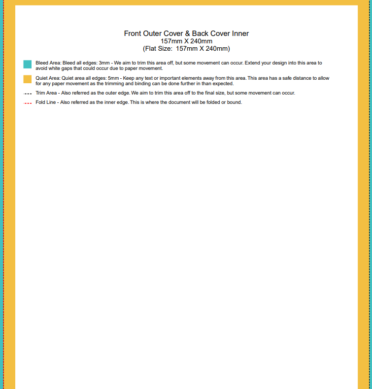
UK Standard 157 mm x 240 mm Paperback Comic Books Staple
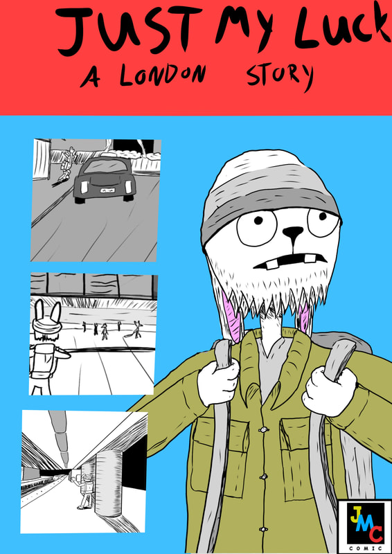
Comic cover inspirations
Show little but still what happens in the comic. Manga like one piece show characters that are in the story, comic about a car showing just the car or comic about art being artsy to grab attention.
|
|
|
|
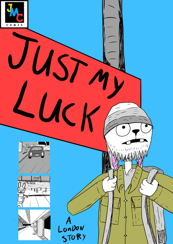
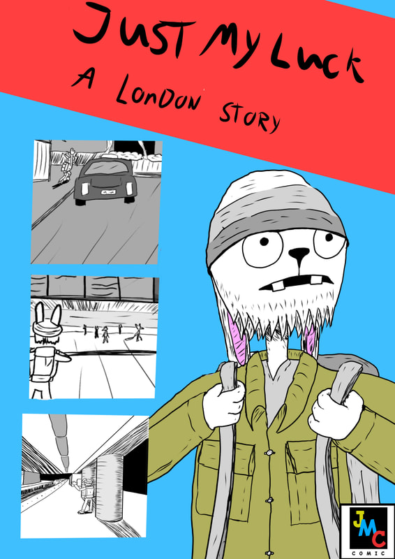
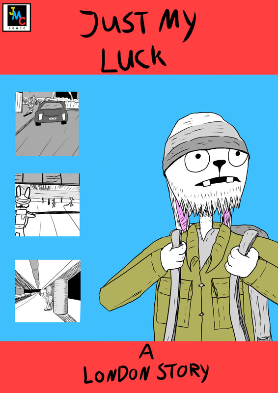
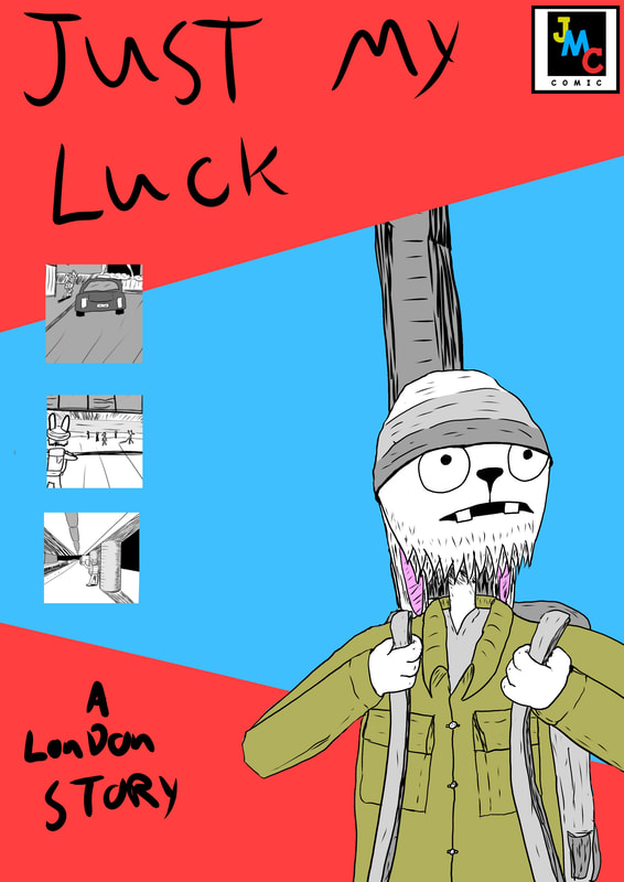
Thumbnail of comic cover and ideas
|
|
Ideas on how it should look
Colours are based on comic Weird Work
|
|
|
Not the finish work. These are sketches. Well the Rabbit is "finished". The colours are too similar to Weird work covers. I might just end up using him in colour while the rest are black and white and grey. The first one is a bit better but the other two remind me of EC comic tales from the Crypt. The colours are both temporary. Using the colours of JMC colours
Test Print comic
print either 20 or 30 comics
Cheaper to print comic with coloured cover and black and white pages than print than have the comic set to coloured but only two pages coloured and rest in black and white so the comic will have different settings
Cheaper to print comic with coloured cover and black and white pages than print than have the comic set to coloured but only two pages coloured and rest in black and white so the comic will have different settings
Some things i fixed and some i forgot but this is what i did to my test copy. The numbers are for me to count what i had left when fixing
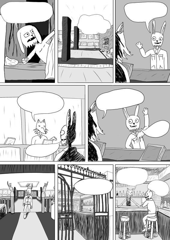
Comic with text in bubbles
What i can do like Tony said is to have text like this "Have it written like it is a book and have names like MANNY and JOSH like this but problem is the names are not said too much in the book but i can do it with BRITANNIA INTERNATIONAL and also EUSTON TRAIN STATION and more in portanlty CARLISLE" it can work.
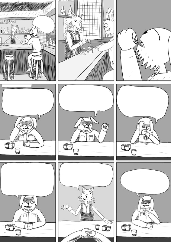
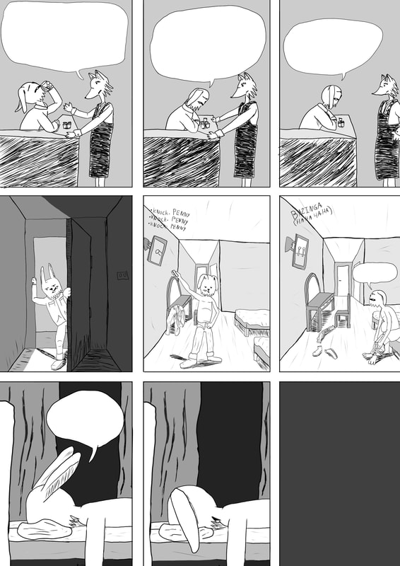
But do to some odd reason Illustration just shut off and i forgot to save so i either rewrote everything or have it as it is. Having the text in all caps fills blank spot which lower would create empty gaps
But do to some odd reason Illustration just shut off and i forgot to save so i either rewrote everything or have it as it is. Having the text in all caps fills blank spot which lower would create empty gaps

The font is temporary until i find a better one. If i dont find one i will print it as is. A lot of text in some panels i know but its my first time printing a comic and learning from this one, i will be making the sketch first in A4 and see the texxt that way and work like that instead of A2
What i learned from this comic
what to do/what not to do
So working on my first comic i see that it is best to work smaller than A2 paper. When working smaller you dont have to go back and redraw something to make it bigger or fix details.
Working on A4 i will see what works. Try and make the character design be more like it looked in the first panel instead of making it look like the head is too small, too big, legs small and long, arms half the leght and then too long, try and make more background characters than just ignore them and make the comic feel empty with just me and one or two other, do not work on details that do not matter and work on details that do matter, try and make speech bubbles not have too much text so it feels like a chore to read. The one this i learned also with is NOT to make it have all of these grey scale thing. do not make the speech bubbles with the drawings but later when you are done drawing the page
Working on A4 i will see what works. Try and make the character design be more like it looked in the first panel instead of making it look like the head is too small, too big, legs small and long, arms half the leght and then too long, try and make more background characters than just ignore them and make the comic feel empty with just me and one or two other, do not work on details that do not matter and work on details that do matter, try and make speech bubbles not have too much text so it feels like a chore to read. The one this i learned also with is NOT to make it have all of these grey scale thing. do not make the speech bubbles with the drawings but later when you are done drawing the page
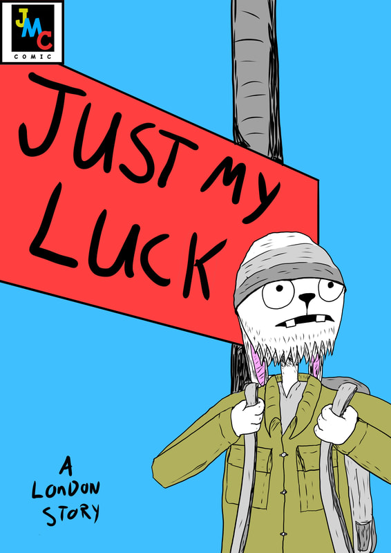
New logo idea
After a hard moment i left JMC comic that me and my friends created. There was nothing happening and we were not working on any comic, only one which was being re-written and changed so much it was made that my ideas are not in the story anymore. So i am creating just my own comic prints having my name on it.
Old logo vs new and cover with new logo
|
|
|
remove the black ink spot. not working
Covers with new logo
Next time don't have the text all in one place. Make them more around than pile above. A lot of thank you
Final print test and outcome (outcome)
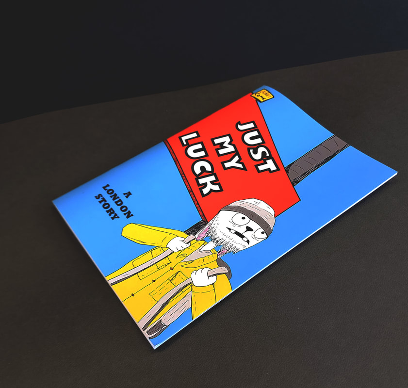
Fixed the spelling and changed some lines.